
How to Choose a Color Palette for Your Website
Choosing the right color palette is essential for creating a visually appealing and effective website. Colors influence user perception, convey brand identity, and affect how visitors interact with your content. Whether you're designing a personal blog, an online store, or a business site, selecting a cohesive and accessible color scheme can significantly enhance the user experience. In this post, we'll guide you through practical steps to choose the perfect color palette for your website.
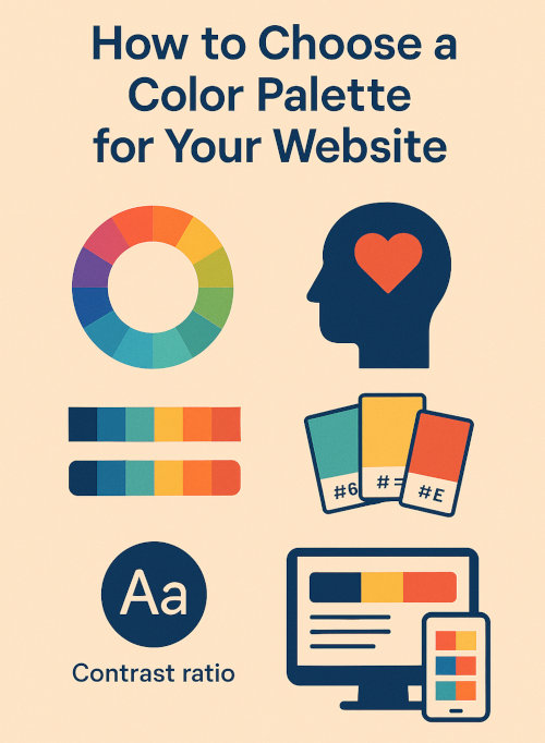
1. Understand the Psychology of Colors
Different colors evoke different emotions and reactions. Understanding basic color psychology can help you choose shades that align with your brand message and user expectations.
- Red: Passion, urgency, excitement - often used for calls to action.
- Blue: Trust, professionalism, calm - common in corporate and tech sites.
- Green: Growth, nature, health - popular in eco-friendly and wellness sites.
- Yellow: Energy, optimism, attention - good for youth-oriented brands.
- Black: Elegance, luxury, power - frequently used in fashion and luxury goods.
Tip: Think about the emotions and values you want your site to communicate when picking the colors you want to go with.
2. Know Your Brand and Audience
Your color choices should reflect your brand's personality and appeal to your target audience. A children's site might use bright, playful colors, while a financial consulting firm would benefit from a more conservative and professional palette.
Ask yourself:
- What are my brand's core values?
- Who is my target audience?
- How do I want users to feel when visiting my site?
3. Start with a Base Color
Choose one dominant color that captures your brand's identity. This will be the foundation of your palette and used in prominent areas like headers, logos, buttons, or navigation bars.
body {
background-color: #f4f4f4;
color: #333;
}
.header {
background-color: #2c3e50; /* base color */
}
Tip: Use color pickers or brand guidelines to find the exact hex code for consistency.
4. Add Complementary and Accent Colors
Once you've chosen your base color, add 2–3 complementary or accent colors to create contrast and highlight important elements like buttons, links, or banners.
Use tools like Coolors or Adobe Color to generate matching color schemes based on your base color.
Popular combinations:
- Monochromatic: Different shades of a single color
- Analogous: Colors next to each other on the color wheel
- Complementary: Colors opposite each other on the color wheel
5. Ensure Good Contrast and Accessibility
Your color palette should be visually appealing and easy to read for all users. Check that your text has enough contrast against background colors to meet WCAG accessibility standards.
a {
color: #e74c3c; /* accent color */
}
a:hover {
color: #c0392b;
}
Tip: Use accessible color combinations to improve usability and meet compliance requirements.
6. Limit Your Palette to 3-5 Colors
Using too many colors can overwhelm your visitors and dilute your brand identity. Stick to a limited color palette-typically one primary, one secondary and a couple of accents.
Neutral colors like white, gray or black help balance bold tones and create clean, readable layouts.
7. Test Your Palette Across Devices
Colors can appear differently on various screens and browsers. Always test your chosen palette on desktops, tablets and smartphones to ensure consistency and clarity.
Tip: Use browser developer tools and mobile emulators to preview your site across platforms.
8. Document and Reuse Your Palette
Once you've finalized your palette, document the exact color values and apply them consistently across your CSS and design files. Consider setting CSS variables for easy maintenance.
:root {
--primary-color: #2c3e50;
--accent-color: #e74c3c;
--background: #f4f4f4;
}
Tip: Reusing your palette ensures visual harmony and branding consistency throughout your site.
Choosing a color palette is more than just picking colors that look good. It's about reinforcing your brand, improving usability and creating a cohesive experience. By understanding color psychology, knowing your audience and testing for accessibility, you can build a palette that makes your website both beautiful and functional. Use the tips and tools above to experiment and refine your perfect color combination.
More Web Design Tips
10 Typography Tips for Better Website Readability How to Fix “404 Favicon Not Found” Error How to Make Form Input Fields Required Allow File Download After Email Address Submission How to Create a Custom Cookie Notice for EU Cookie Law How to Add a Favicon (Bookmark Icon) to Your Website Which Notepad++ Plugins to Use
Web Design Tips