
10 Typography Tips for Better Website Readability
Typography plays a crucial role in how users engage with a website. Clear, legible text enhances readability, improves user experience, and keeps visitors on the page longer. Whether you're designing for desktops or mobile devices, applying the right typography principles can make your content more accessible and professional. In this guide, we'll explore ten essential typography tips that every web designer and developer should follow to create better, more readable websites.
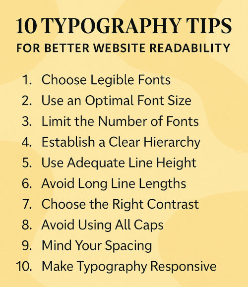
1. Choose Legible Fonts
The first thing you can do to increase readability of your website is to pick fonts that are easy to read across various screen sizes and resolutions. Sans-serif fonts like Arial, Helvetica, and Roboto are commonly used for digital interfaces due to their clean and modern appearance. Avoid overly decorative or script fonts for body text.
2. Use an Optimal Font Size
Font size directly affects readability. A good base size for body text is typically 16px. You can adjust sizes for headings and subheadings, but ensure there's a clear visual hierarchy. Responsive typography tools like Modular Scale can help you set consistent scaling.
3. Limit the Number of Fonts
Stick to no more than two or three fonts on your website to avoid visual clutter. Mixing too many fonts can distract readers and make your content harder to follow. Instead, use variations like bold, italic or different weights to create contrast.
4. Establish a Clear Hierarchy
Use headings (h1 to h6), subheadings and paragraphs to create a logical structure. Larger font sizes and bold weights should be used for primary titles, while body text remains smaller and lighter.
5. Use Adequate Line Height
Line height or leading, impacts how text blocks are scanned. A line height of 1.5 to 1.75 times the font size is considered optimal for body text. Proper spacing avoids cramped text and helps guide the reader's eye.
6. Avoid Long Line Lengths
Text lines that are too long or too short hinder readability. Aim for a line length of 50–75 characters per line for desktop and slightly less for mobile. Use CSS to control widths and maintain a consistent reading rhythm.
7. Choose the Right Contrast
Ensure there is sufficient contrast between text and background. Black text on a white background is most common, but dark gray on light gray can be easier on the eyes. Tools like WebAIM Contrast Checker help maintain accessibility standards.
8. Avoid Using All Caps
All capital letters can appear aggressive and are harder to read in large blocks. Use all caps only for short labels or navigation links. For normal text and headings, stick to sentence or title case to ensure clarity.
9. Mind Your Spacing
Adjust letter spacing (tracking) and word spacing to improve flow. Tight or overly loose spacing can disrupt reading. CSS properties like letter-spacing and word-spacing can help you fine-tune your typography layout.
10. Make Typography Responsive
Use media queries and scalable units like em or rem to ensure that your typography adjusts to different screen sizes. Tools like Utopia provide flexible, fluid typography systems for responsive design.
Implementing effective typography improves your website's readability, enhances user experience, and contributes to better engagement. By choosing the right fonts, sizes, spacing and structure, you make your content more accessible and professional for all visitors.
More Web Design Tips
How to Choose a Color Palette for Your Website How to Fix “404 Favicon Not Found” Error How to Make Form Input Fields Required Allow File Download After Email Address Submission How to Create a Custom Cookie Notice for EU Cookie Law How to Add a Favicon (Bookmark Icon) to Your Website Which Notepad++ Plugins to Use
Web Design Tips